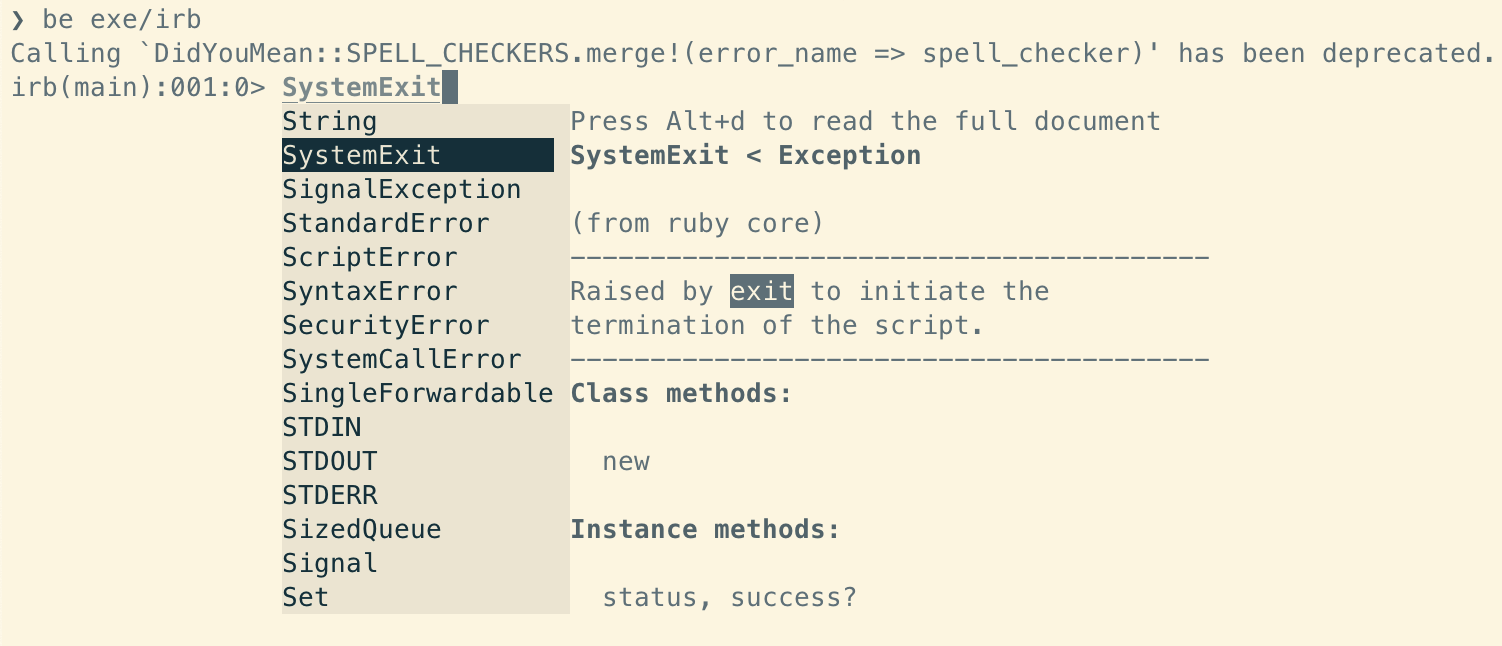
Feature #19010
closedFollow up of #18996: Support changing irb's autocompletion background
Description
If the APIs proposed in #18996 (or similar ones) are accepted, we'll be able to configure irb's autocompletion dialog colors.
And for the irb side, I want to propose 2 levels of configurations:
TL;DR
- Have
dark/brightthemes inirb - Use
darktheme by default because a bright dropdown in dark background is more uncomfortable to read than a dark dropdown in bright background. -
irbwill pass per-colour configuration torelinetoo. So users can still configure individual colours if they want to.
1. Theme selection
Consider most users don't care about individual colors if the text are readable and roughly match with the terminal background, I want to provide 2 basic themes (dark/bright) for users to choose:
Theme:dark


Theme :bright


Default
In terms of default, I think dark is better than bright. Because when in a bright terminal, seeing a dark dropdown isn't so troubling. But when in a dark terminal, seeing a large bright dropdown can bring discomfort to eyes.
Side note: It's possible to detect the terminal's background color from an xterm-compatible terminal emulator (example gist), so irb may automatically assign themes based on users' terminal theme. But we still need to pick a default as the fallback.
Interface for theme selection
If we think it's possible to introduce more themes than just dark/bright, we can expose the API as
IRB.conf[:DIALOG_THEME] = theme_name
If we don't consider introducing other themes, we can make it a toggle for the non-default theme, like
IRB.conf[:USE_BRIGHT_THEME] = true
2. Per-color configurations
For users who want to configure individual colors, we should also provide options on the irb side, like
IRB.conf[:dialog_default_bg_color] = :black
This prevents directly exposing reline's API to normal irb users.
I implemented the ideas in this proof of concept PR.
Files
 Updated by kaiquekandykoga (Kaíque Koga) over 3 years ago
I like the idea of having multiple themes. I use light screen for everything, and I enjoy the way irb is currently displayed. Perhaps keeping the current irb's colors as one alternative, and add the proposed light theme and dark theme too. Some people use other colors than black or white for terminals, like blue for instance, so having a few themes thinking about that can help.
About the default color. I like to use autocompletion, but I know that some people dislike having enabled autocompletion by default. So if irb start showing the autocompletion only if a theme is set, there is not need to think about a default color.
 Updated by st0012 (Stan Lo) over 3 years ago
kaiquekandykoga (Kaíque Koga) wrote in #note-1:
Perhaps keeping the current irb's colors as one alternative
irb doesn't have a theme at the moment. The colours we see are reline's default values for the dialog UI. And it's not a complete set of configurations either. reline only sets background colours of items, but not the foreground (text) colours. That's why it works for some users but not others (like me), depends on the text colours of their themes.
You can learn more about reline's colour APIs in #18996
Some people use other colors than black or white for terminals, like blue for instance, so having a few themes thinking about that can help.
People can have dozens or even hundreds of different background colours, so it's not possible for irb to have themes to nicely match them. And it's not the purpose of themes either. It's to provide acceptable colour contrasts to help users read the content.
About the default color. I like to use autocompletion, but I know that some people dislike having enabled autocompletion by default. So if irb start showing the autocompletion only if a theme is set, there is not need to think about a default color.
I disagree with this. People usually don't look up a tool's features proactively. So if we disabled it, it's likely that most users won't even know about it. And this very helpful feature will end up benefit a lot fewer users than it could have helped.
What we should do instead, is to
- Reduce the things that make people dislike it as much as we can (like improving the colours)
- Make it easy to disable the feature
So even if some users disabled it now, at least they now this feature exists and there are people improving it. It's way better than having most people unaware of it IMO.
 Updated by st0012 (Stan Lo) over 3 years ago
- Description updated (diff)
 Updated by st0012 (Stan Lo) over 3 years ago
- Tracker changed from Bug to Feature
- Backport deleted (
2.7: UNKNOWN, 3.0: UNKNOWN, 3.1: UNKNOWN)
 Updated by kaiquekandykoga (Kaíque Koga) over 3 years ago
I agree and support your arguments.
Thank you for the detailed explanation and the reline's reference.
 Updated by mame (Yusuke Endoh) over 3 years ago
Briefly discussed at the dev meeting, but we agreed that we need to finish #18996 first.
Here are the opinions expressed at the meeting:
- The color there should be not only for the dialog but also other things (such as the syntax highlight). So
DIALOG_THEMEis not a good name.IRB_THEME? - The names
:darkand:brightis confusing because those who use a bright (white background) terminal must choose:darktheme. Better names are wanted.
 Updated by mame (Yusuke Endoh) over 3 years ago
- Related to Feature #18996: Proposal: Introduce new APIs to reline for changing dialog UI colours added
 Updated by hsbt (Hiroshi SHIBATA) over 2 years ago
- Status changed from Open to Closed